As the lead designer on the project, I worked closely with Fulflex stakeholders and UX Designers to define goals and validate concepts from the discovery process till the final output. I collaborated with the development team to implement my designs and provided design QA and
support until the launch.
support until the launch.
My Role: Stakeholder Discussions, UX Design, UI Design, Prototype, Design System, Design QA.
Collaborators : 3 UX Designers, 2 UI Designers, 1 Project Manager, and 5 developers.
Tools: Figma, Adobe Photoshop.
Collaborators : 3 UX Designers, 2 UI Designers, 1 Project Manager, and 5 developers.
Tools: Figma, Adobe Photoshop.
Live Site: https://www.fulflex.com
Challenges
To design a unified website for all 3 brands and define a single visual language.
Create a design system as per the current trends to appear as a young brand with a legacy of 80+ years.
To help the user discover their capabilities, products, markets, and product applications easily, and establish a cross-functional link among the above.
To showcase their innovations and technological advancements to spark new collaborations.
To reduce the bounce rates.
Goal
Become the most admired global Polymer products business.
The goal is to design an engaging and interactive unified digital property for its stakeholders and customers.
While Fulflex products are the backbone for some of the most recognized brands, such as 3M, Jockey, and Decathlon to name a few. But it’s important to understand and communicate that it’s an ingredient brand.
To establish a visual identity as an American brand with a local presence across the globe.
Solution
Experience Our Journey: Our Website needs to Engage the Users through creative storytelling.
Technology & People: Our website needs to help people Visualize the advances in technology, processes, etc.
Ideas and Inspiration: Our Website needs to Facilitate and encourage collaboration of thoughts, ideas, and applications.
Solutions that generate Interest: Our website needs to Guide and Explain the range, products, and applications to our users.
Listening & Understanding: Our website needs to make it convenient for our users to Communicate with Fulflex and ensure easy accessibility to the brand i.e. reach out easily.
Showcase the range of products in categories.
Showcase the applications of the products clearly.
Bring out the features of the product clearly.
Talk about the process without divulging critical information about the technology.
Build a distinct PAN Global brand identity.
Generate social proof without divulging critical information.
Communicate Premium Service by speaking about the relationships built by the key account management teams.
Design Process

Users
Based on the interviews conducted during the discovery process and insights received from the user research having understood the business, its offerings, and its customers following personas were identified.
Profiles: The Buyers, The Designers, R&D Specialist, Brand Managers, Sourcing teams in Medical Industry, Big Retailers, and Small Distributors.
Age Group: 25 +

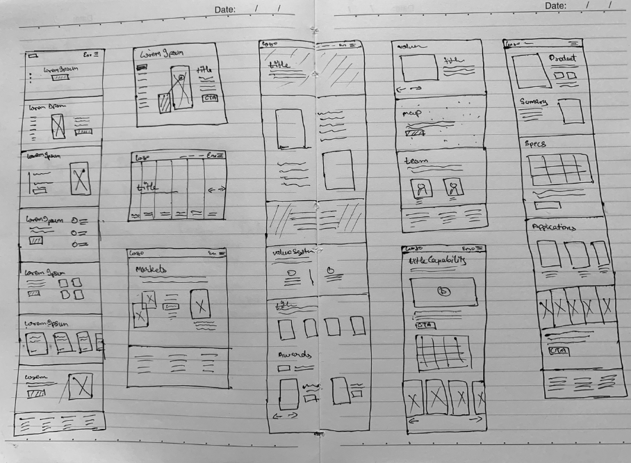
Sketches & Wireframes
With the gathered information from the discovery phase, it was time to start drawing some stuff. The purpose was to simplify the content structure as we had to cover a lot of information without increasing the cognitive load on the user and at the same time bring an entirely new user experience.
For this project, we wanted to give our UI an update on what we'd had before. I had never had the opportunity to create a web-first experience and wanted to put my best foot forward. I spent time researching various websites and sketched out various options.
I explored various approaches to determine the best experience and different look and feel of the website and collaborated with designers and stakeholders along the way to validate the concepts and gather feedback to continue improving the experience.
I then showed these sketches to the team to get their thoughts on what layout and experience would work and what wouldn't, before moving on to creating wireframes. After the approvals of design concepts, I translated the sketches into high-fidelity wireframes.

Design Exploration and Style Guide
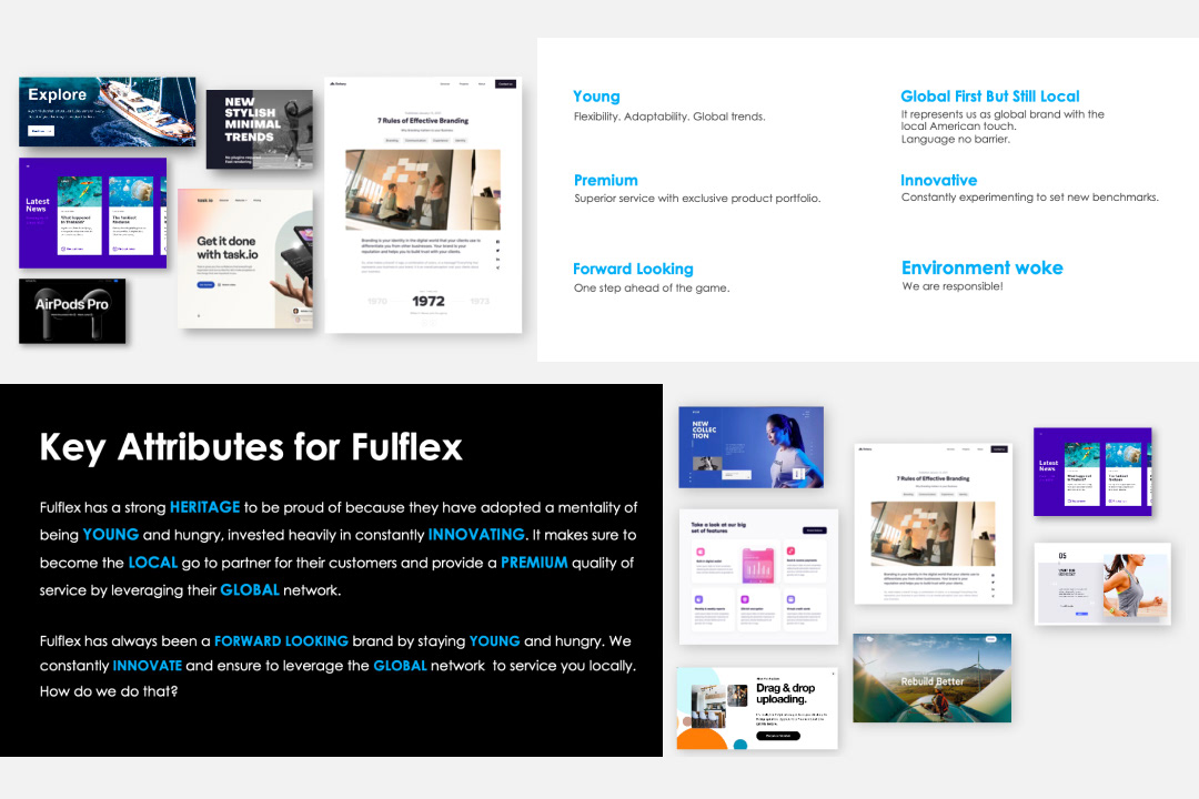
We identified and defined the key attributes of the brand based on stakeholder interviews. In addition, we held a moodboard workshop with all stakeholders to better understand their vision for the unified brand. The workshop activities resulted in the identification and definition of key visual appearance attributes. They desired to appear young, forward-thinking, premium, classic, innovative, and global while remaining local.
I created the final moodboard, which included a theme, typeface, colors, imagery, and iconography. A design system was created, which included a style guide, UI components, and guidelines. I created a versatile design system that includes visual styles, components, and a comprehensive set of usage guidelines and best practices. The design system not only increased efficiency during the design process but also ensured that the platform could evolve while maintaining visual consistency.
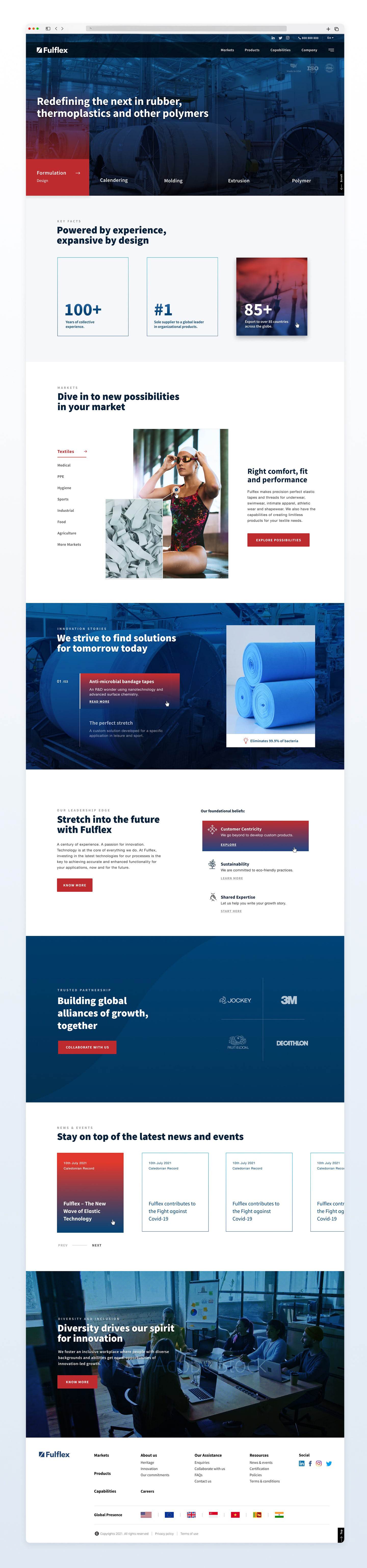
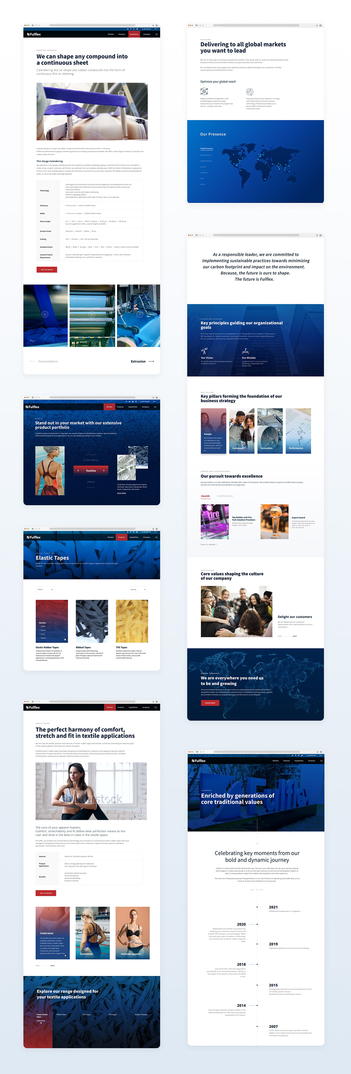
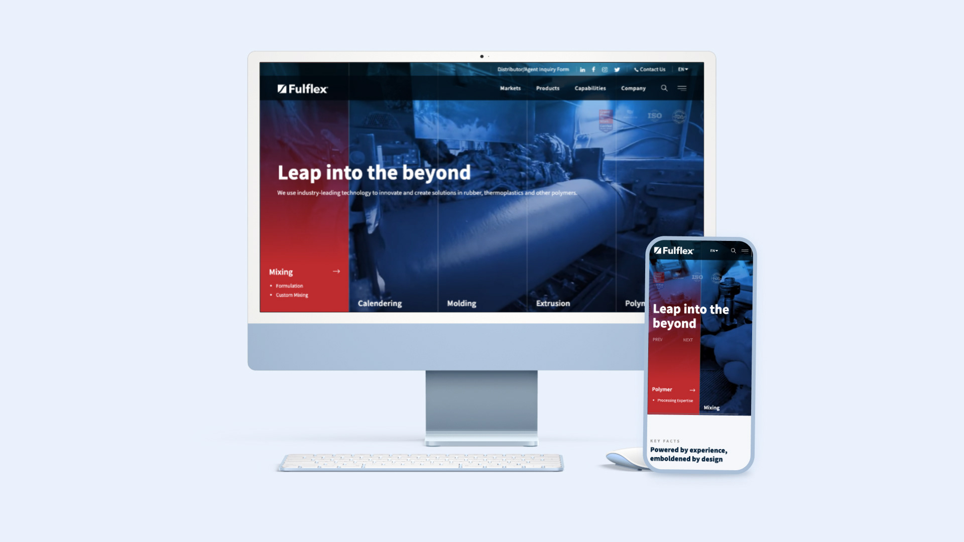
UI DESIGN
The objective was to create a youthful and high-end website design.
I conducted thorough research on layout styles, transitions, and current design trends.
Using Figma, I developed the final screens by incorporating elements from the design system and moodboard. During the implementation phase, I paid meticulous attention to maintaining color hierarchies and utilized ample white space to ensure clean and balanced layouts amidst the vibrant colors.
To align with our minimalistic blue theme, we carefully selected photography that harmonized with the overall aesthetic.
Live Site : https://www.fulflex.com/