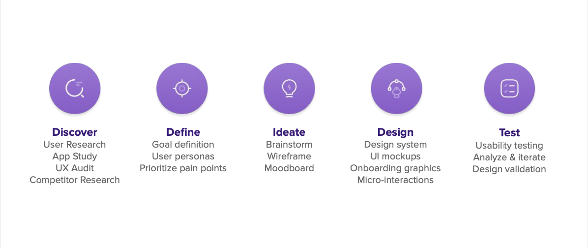
Goals
The goals were to revamp the project to enhance user experience and engagement for the target audience (18-26 age group), improve app usability and intuitiveness for non-savvy users, implement a minimal design approach to reduce cognitive load, maintain consistency and efficiency through a design system, enhance onboarding for new customers with graphical elements or illustrations, and increase user delight through the incorporation of micro-interactions.
Challenges
The design revamp project for PhonePay faces challenges in balancing a minimal design approach with necessary functionality, addressing the target audience's needs and preferences, ensuring a seamless transition for existing users, maintaining brand identity while revising color usage, designing an engaging onboarding process, and meeting the implementation timeline of one week.
User Persona
Blanca Fernandes - 32 years, Mumbai
Works with Wipro for the last ten years
Works with Wipro for the last ten years
Characteristics:
● Empathetic and hard-working professional.
● Not tech-savvy.
● Faces difficulties in day-to-day online payments.
● Skeptical about using payment apps due to security concerns.
● Prefers cash payments but faces challenges with availability.
● Lacks the motivation to use payment apps due to complexity and lack of intuitiveness.
● Downloaded an app but uninstalled it due to complicated UI and perceived lack of safety.
New Target Audience - 18-26 years, India
Students, Homemakers, Full time / Part Time Professionals
Students, Homemakers, Full time / Part Time Professionals
Characteristics:
● Tech-savvy and comfortable with mobile apps and online transactions.
● Embraces digital payment solutions, exploring new features and technologies.
● Regular app usage, shares experiences and recommendations with peers.
● Limited budget, seeking discounts, managing expenses efficiently.
● Prefers quick and hassle-free payment process, personalized recommendations, social integration
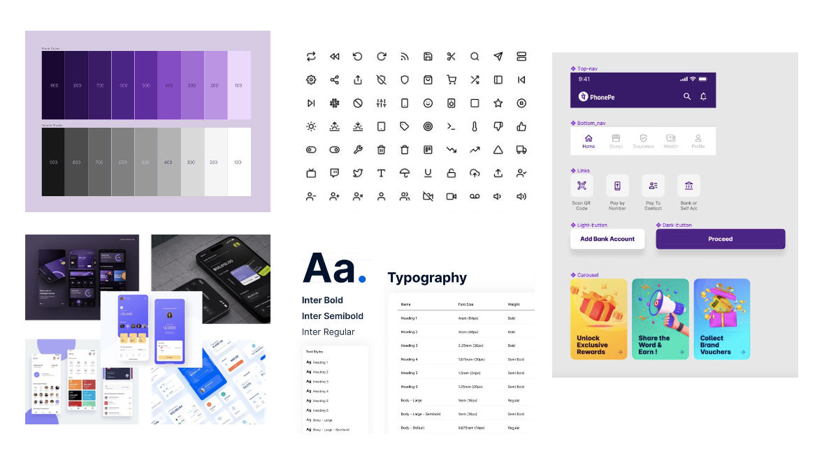
MOODBOARD & COMPONENTS
The aim is to capture the essence of the design direction and evoke the desired emotions and experiences. It will serve as a visual reference and inspiration for the design team, ensuring a cohesive and consistent design approach.
Color Palette
Bright and vibrant colors appeal to the target audience, with a focus on youthful tones and complementary combinations.
Minimalist Design
Clean and uncluttered interface, emphasizing simplicity, white space, and reduced cognitive load.
Illustrations and Graphics
Engaging and trustworthy illustrations, consistent style, and graphics highlighting key app features.
Typography
Contemporary and legible typefaces, with variations in weight and size for visual interest and hierarchy.
Micro-interactions
Delightful animations enhance user interactions, smooth transitions, and responsive feedback.
User-Centric Photography
Authentic and diverse images showcasing the target age group, reflecting positive emotions and empowerment in financial management.
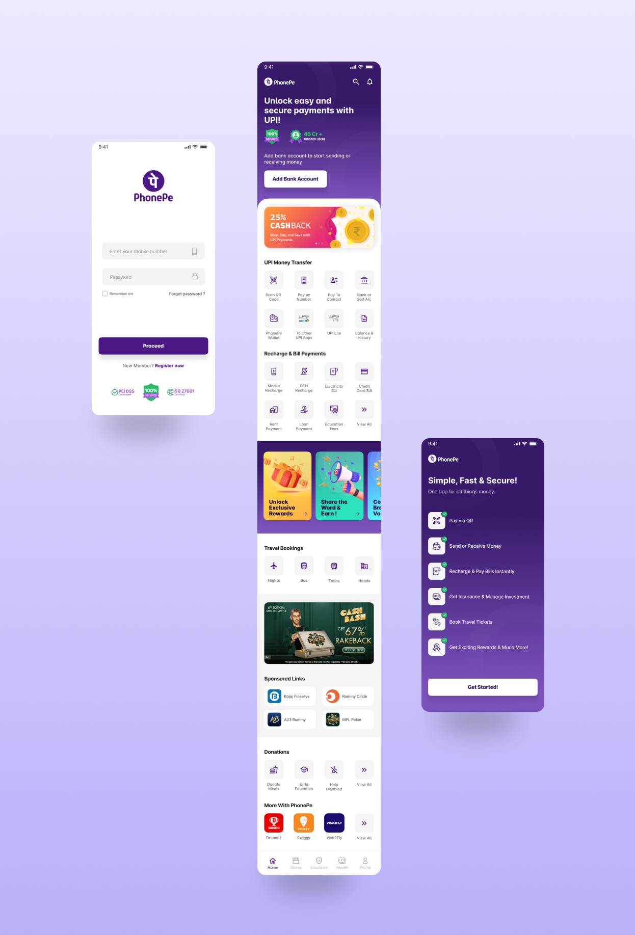
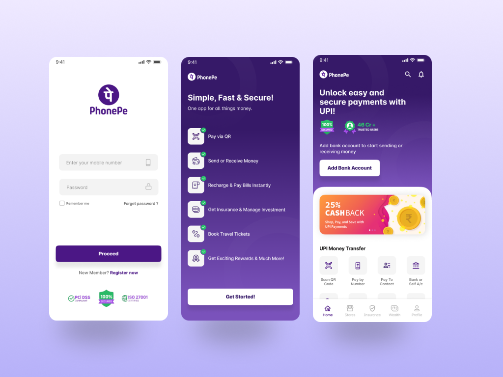
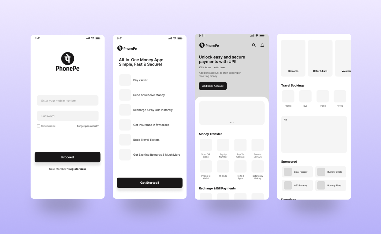
UI DESIGN